Burger King’s Retro-Mod Rebrand
Taking a step back in order to move forward

Let’s just get it out there: I refuse to eat at Burger King and you’ll never see me with a Whopper in my hands, but I loved everything about this rebrand.
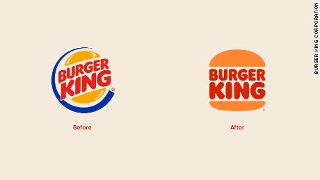
It’s been nearly 20 years since Burger King gave their brand a facelift and I think we can all agree that it was long overdue. The fast food industry has gone through some major changes in the last 20 years, including major pushes for health consciousness and sustainability. There was nothing inherently wrong with the late 90’s logo, but nobody ever looks back at the 90’s and says “Man, we were just eating so damn healthy back then.”
Don’t believe me? Listen to what Lisa Smith had to say about the redesign. She’s the Executive Creative Director at Jones Knowles Ritchie, (aka she was really important to this project). “We wanted to use design to close the gap between the negative perceptions people have of fast food and the positive reality of our food story by making the brand feel less synthetic, artificial, and cheap, and more real, crave-able, and tasty.” (1)
In order for Burger King to break the stereotypical mold of the fast food industry and to take their company forward, its branding had to take a step back. Fernando Machado, Global CMO of Restaurant Brands International, says their main source of inspiration was the logo that lasted 30 years from 1969 to 1999 (2). You remember 1969, right? It was the summer that Bryan Adams got his first real 6 string and played it ‘till his fingers bled...where were we?

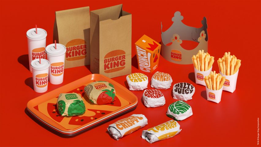
“The main difference now is that we adjusted the color to make it more vibrant and more like the colors of food,” Machado would go on to say. The earth(ish) tones of the new logo give off Chipotle and Starbucks vibes. They’re the kind of colors that make you say to yourself “Sure, this is fast food, but it was clearly made with love and that makes all the difference to me.”
“The font is yummy and round, just like our food,” said Machado. Hold the phone. You had me on your side right up until you said “yummy”. Unless you’re Justin Bieber or 6 years old, please don’t say that ever again. Anyway, you get the point. Burger King wanted to simplify their logo to represent how wholesome and *delicious* their food is.
Another reason that they were due for a facelift is that the old logo just didn’t stand the test of time. “Burger King’s redesign comes at a time when major brands across sectors are flattening and simplifying their look so that it’s functional and legible in digital spaces,” says Smith. The last time Burger King created a logo, we didn’t have smartphones, social media and tons of different user interfaces. 90% of its job was literally to stand there and look pretty on a billboard. With advertising being more accessible now than ever, it was time to move on.
So why do we love this rebrand so damn much? It’s 3 things:
1: It’s a throwback, and everyone loves a throwback.
2: It looks just about as healthy and wholesome as a fast food burger joint can look. (it’s Burger King for crying out loud, not Salad King)
3: Logos from the 90’s weren’t designed for iPhones, and they had to adapt to stay relevant.
The ever changing digital landscape can be a tricky one to navigate, but our full service marketing team can help create your brand, find your voice, and keep your digital presence fresh and relevant for the long run. Whether you’re starting your business from the ground up or you’re looking to add those minor tweaks to make your website pop, IOI Ventures has got you covered.
